Price Performance in High-end Audio (and elsewhere)
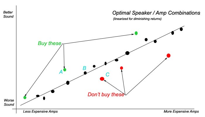
What this graph shows, is that, for a given speaker, different amps provide various degrees of sound quality.
The more expensive the amp, the better the sound quality… on average… and that adjusting for diminishing returns (paying twice as much does not usually result in twice the sound quality), most amps perform more or less where they should based on their price [i.e. their performance point lies on the ‘line’ which represents average performance for a given cost.].
But, as you can see, some amps under-perform at the price point [for this one hypothetical speaker] and others over-perform. Assuming you are not loony tunes – you will probably want to spend your hard-earned dolluhs on one of the over-performing amps. Or at least on one of the average performing amps.
Note that what we are showing here is a graph that says performance is directly related to sound quality. For many people, there are other things that they consider when buying an amp. Things such as appearance, provenance, brand, resale value, marketing slogans, discounts, technology, social network buzz, maintenance requirements, and other such things unrelated to sound quality.
Another thing which attracts peoples attention away from the basic truth of graphs like this, which is applicable in many other domains besides high-end audio, is the relationship between amps A, B, and C. This rare but real anomaly [and originator of so many conspiracy theories and misinterpretations about the way capitalism works], is where A is less expensive than B, and B less expensive than C, yet A outperforms them both. In this contrived example, the manufacturer of A has made a mistake [possibly on purpose if they are altruistic] and under-priced their amp and manufacturer of C has over-priced it [definitely on purpose]. The manufacturer of B has priced their amp just right.
Many people who cycle through amp after amp after amp, all they are looking for is an over-performing amp in the ‘A’ position, or maybe even in the ‘B’ position if ‘C’ is very popular. It makes them feel so good to have an over-preforming amp [or other over-performing component] that they spend [lose] $10’s of thousands in buying and selling amps just to find this particular one. Of course, in a perfect world, dealers and the press should be pointing out these over-performers so they would not have to waste all this money and time [and Mike Fremer does do this in turntable land] but it is almost unheard of them to do so – perhaps because they do not hear a lot of the candidates in a particular market segment to get a feel for where that average price-performance line is, or, unfortunately, because they cannot understand and categorize what they are hearing in a quantitative way.
The concept of this graph was brought up in the comments a little while ago, and we may continue to explore this graph, as we did in those comments, to nail down other component to component relationships that are kind of murky.
The Great Cable Debate will rage on, regardless of what we say or do here. My issue is that I’ve aulcatly sat down and been treated to an anonymous cable demo. I wasn’t able to see what was being done, all I was told was that something had been changed (which wasn’t always true), and then I was asked to listen. It opened my eyes, but I was most definitely not happy about it.