Another way to visualize the sonic signature of a system
We have guests here for ‘multi-day auditions’ every so often where we listen to a ton of stuff over the course of a few days – kind of like a sequence of shootouts but with a goal in mind – the goal usually being to get the best sound possible for a particular guest.
Last week we had a great time at one of these auditions, and our guest came up with a very nice intuitive way to quickly draw the overall balance of a particular system. I am not all that sure this particular guest wants to accept the blame for these drawings 🙂 – and his hand drawn ones were certainly nicer than my mouse-drawn ones – but I liked them enough to think it worthwhile to share here on the blog.
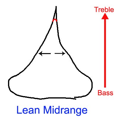
The width of the “Hershey’s Kiss'” is the characteristic energy/information of the system at a given frequency. The system diagrammed here has a lot of bass energy but little midrange energy and almost no treble energy.
This is typically [over the course of many discussions with people we meet] what people Do Not want.
The red part of the curve would be an alternative sound that did not have a ‘bite’.(?)
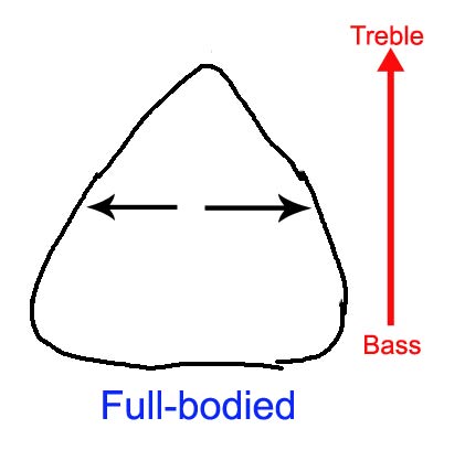
This is a nice, full sounding system. This is what people in general DO want.
These next drawings are originally drawn by me, expanding on the idea of the 2 above.
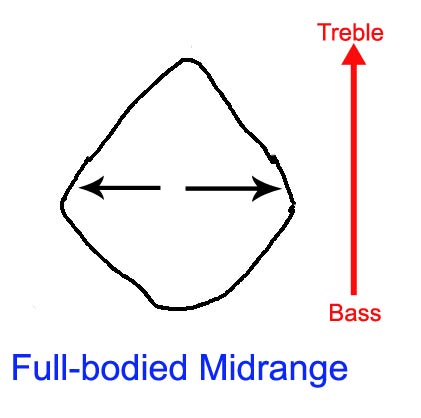
The system diagrammed here might represent your typical inexpensive tube amp: nice midrange but weak on bass and a little rolled off on top.
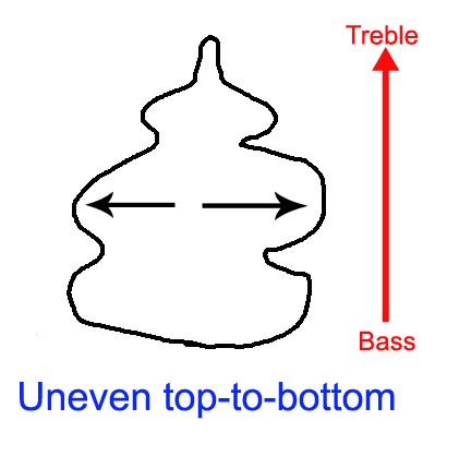
The system diagrammed here might represent your typical inexpensive speaker system that has problems in the crossover frequencies.
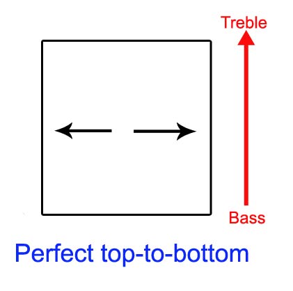
This might be the perfect system(?) – we can certainly define it to be so, since we are the ones making all this up :-). It represents perfect top-to-bottom quantities of energy/information.
We should really have several of these drawings for a single system, one drawing each for:
1) harmonic information/energy
2) micro dynamics
3) midi-dynamics
4) separation (ability to handle complexity)
…
If you split those drawings down the center in half. remove half of it and flip it side ways…… it’s just a frequency domain plot 😉 nothing new really 🙂
Hi Three Quid,
Kind of… but not. 🙂
I think the point is that a lot of speakers/systems measure relatively flat, frequency-wise, but are thin, perhaps to the point of edginess up top and/or thin in the midrange, or etc. etc.
I think PERHAPS that if one took one of J.A.’s waterfall plots, and instead of plotting the magnitude of each freq versus time, one plotted the total sound at that frequency over the time interval [i.e. take the integral of the function, area under the curve, whatever way you want to see it] versus frequency, then we might get what we are intuitively talking about here. This would cause notes that decay too slow [aka sound fuller] to score higher than the notes that decay too quickly [sound lean]. It is, of course, the ‘decays just right’ that would be the optimal graph which I drew, as a strawman, as a flat line [square].
This begs the question: is it true that notes that decay too quickly cause a ‘lean’ sound?
Is anybody even measuring how accurate note decays are for various types of equipment? Do humans have a natural tendency to prefer shorter than true decays or longer than true decays?
BTW, I am told, indirectly, by the visitor that came up with it that these graphs are supposed to be 3D – i.e. like you implied, one takes the curve and turns it sideways – but then we should then sweep out a 3D solid by rotating it around the y axis. I think the idea behind doing this to the graph, which intrigues me, is to give the representation a more ‘tactile’, more ‘human accessible’ feel to the representation.
Take care,
-Mike